I recently shot for Moonika, who is building a portfolio to put herself out there for modelling.
She has the most striking red hair, and so early in the planning process I had to consider how to deal with, and compliment, such a strong colour.
Confession time: I am slightly colour blind, especially when it comes to reds and greens ironically. I often confuse them, particularly when they have similar tonal values. I actually have this constant insecurity that the colour balance in my edited shots isn't very good and no one is telling me I'm messing it up; like maybe everything I shoot has a slight green tinge for example and, best-case-scenario, people think it's a deliberate stylistic choice.
To compensate I have a few photography friends who I bounce my portfolio off to get some honest feedback and see if I'm off track. This is a really good idea by the way, especially while you're learning to colour correct your images. Source some trusted, honest, brutal opinion.
When shooting though, I try and keep the colour wheel in mind to plan out some sort of balance, because it really is as important as spatial composition.
I found this great graphic on visual.ly, which explains many aspects of colour theory and gives a really helpful overview:

Obviously I'm not thinking about all of this when shooting, although I do try and bring some of this knowledge into my compositions. At least knowing this stuff in the back of my mind often helps me to work out when something just 'looks wrong' and I can't figure out why. So it may look very complicated, but let me break down just two of the things I try and stay aware of:
Analogous Colours can add thematic interest. These are colours which sit close to each other on the colour wheel (Pink/Red). If you place these sort of colours together, especially in styling, you can create depth and interest while still playing on a theme.
Opposite Colours provide separation. In colour theory they are called 'Complimentary Colours' (Red/Cyan). They will give you the greatest separation from fore-background, whilst playing nicely together.
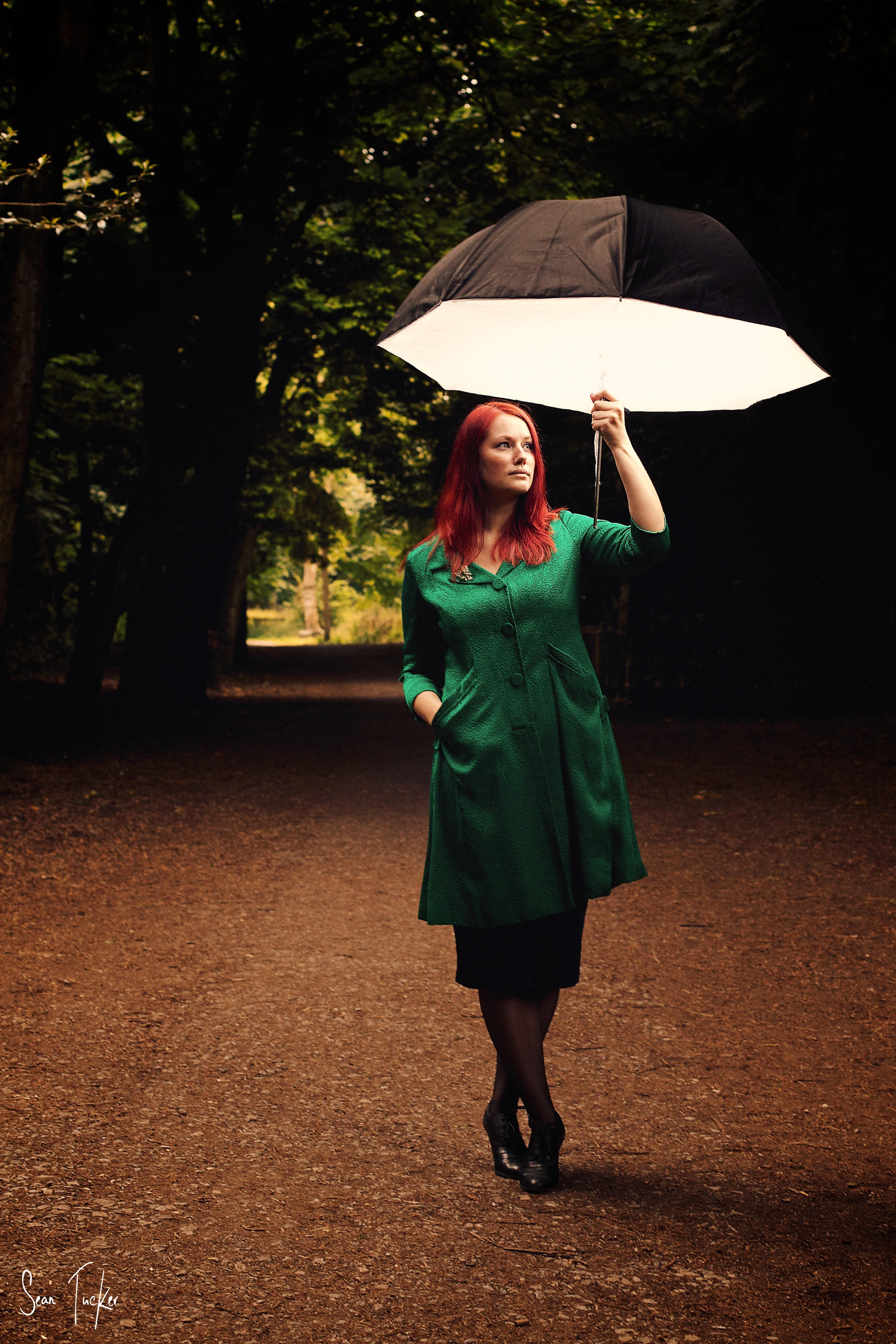
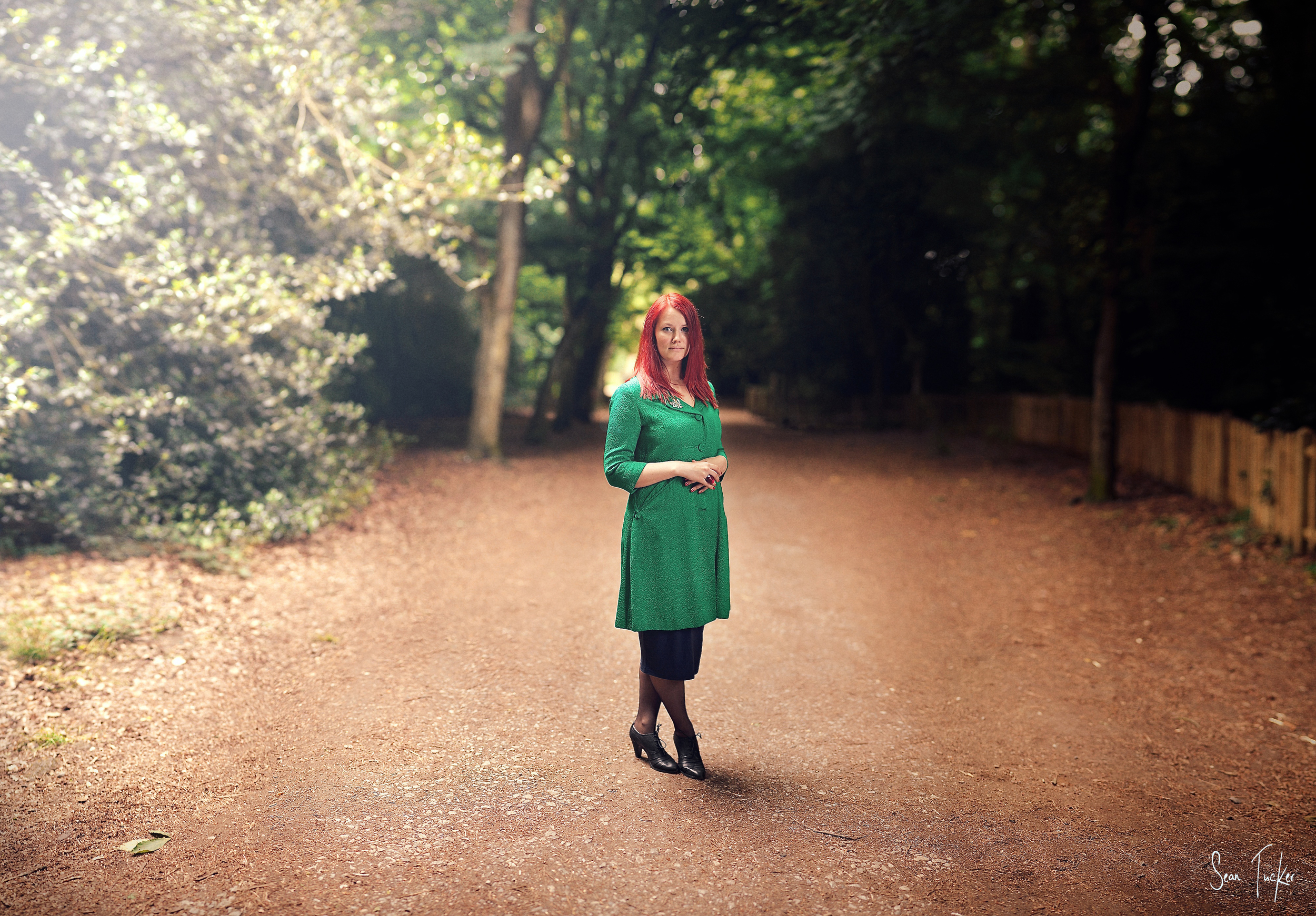
Let's take the next two shots of Moonika to demonstrate.
I used Analogous Colours in the styling. I say "I", but she brought along this pink scarf for the shoot deliberately, and as a costume designer herself, she understood that the combination of the pinks and reds works well together in colour theory. So the pink of the scarf and red of her hair give us an Analogous Colour theme, but now I have to separate her from the background.
The Complimentary Colour for red on the Colour Wheel is cyan, but there was no cyan to hand to use as a backdrop so I tried the next two best options: green and blue (which strictly speaking is triad theory in the graphic above, but I think you'll get the idea).
First I lined her up with a rich green background to make the red of her hair pop and it worked quite well. Fortunately she also had this great green coat which helped me frame the bottom edge of the image too and draw the focus into the middle of the frame. The green also helped to accent the deep green of her eyes and the colours played well together. The point was that I was getting the separation I wanted.

But I also really wanted to try the blue because I had a feeling it would work well and give a very different feel.
On the day, I was shooting with a photographer friend of mine, Radek (Check him out at Bayek Photography). While we were walking around he noticed a bush with very light green leaves, which when blurred out in the bokeh made her dark-toned hair really pop, so we decided to use it as a backdrop for a while. Even when taking the shot I knew what I was going to do with this image in the edit. I wanted to give the impression of a cold, icy background and let the cool desaturated texture give her hair that extra punch and separation, so when I got the image onto the computer I isolated the leaves in the background and turned them a chilly blue/grey. The final image makes me think of the White Witch in the Narnia Chronicles for some reason, but the point is the separation works really well.

I can't pretend that I'm always this deliberate, and admittedly the strong colour of Moonika's hair forced me to think more than I normally may have about this stuff, but I am always working hard to keep colour balance in mind when shooting portraits. It really can make the difference between a flat and uninteresting shot, and one that really pops.